Post
The Psychology of Color in Chairs Design: How Your Chair Color Affects Mood
Jun
The Psychology of Color in Chair Design: How Your Chair Color Affects Mood
Color is one of the most powerful tools in interior design, and it is also one of the most psychologically complex. The colors we surround ourselves with in our homes and workplaces have a measurable influence on our mood, energy levels, creativity, stress response, and even physical sensations. When choosing chairs — particularly statement pieces like accent chairs, dining chairs, or upholstered office chairs — the color you choose is not merely an aesthetic decision. It is a psychological one with real consequences for how you feel in your space every day. This article explores what color psychology research tells us about chair color choices, helping you create spaces that truly resonate with your desired emotional atmosphere and functionality.
The Science Behind Color and Emotion
Color psychology is a well-established field that studies the emotional and behavioral responses humans have to different colors. These responses have both universal elements — certain color associations appear across cultures worldwide — and culturally specific dimensions that vary between societies. The physiological responses to color are also real: studies have measured changes in heart rate, blood pressure, skin conductance, and hormone levels in response to different color environments. For example, exposure to red can increase heart rate, while blue can decrease it.
It is important to note that color effects are not absolute — context, personal history, cultural background, and individual sensitivity all modify how any specific person responds to a given color. The principles that follow are tendencies and guidelines rather than rigid rules, and your own intuitive response to colors should always be considered alongside these general principles. Understanding these nuances allows for a more personalized and effective application of color in your chair selections and overall interior design.
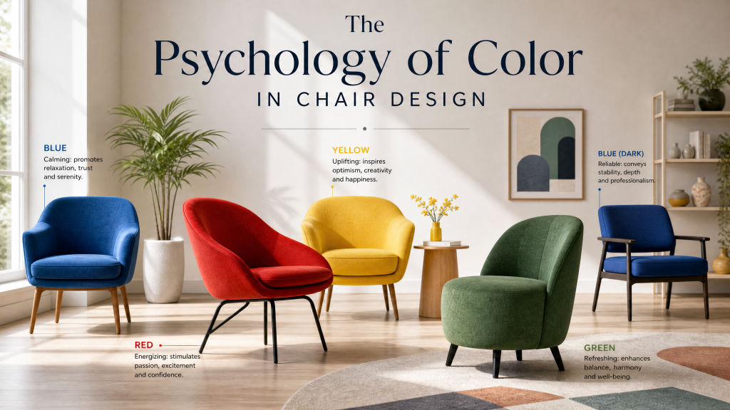
Blue: Calm, Focus, and Productivity
Blue is consistently associated with calmness, focus, and intellectual clarity across numerous psychological studies. Blue environments tend to lower heart rate and reduce feelings of stress and anxiety. In workspace settings, blue has been shown to support sustained concentration and careful analytical thinking. This makes blue an excellent choice for home office chairs, study chairs, and any seating used primarily for focused work. Its ability to promote a sense of order and tranquility makes it ideal for environments where mental clarity is paramount.
Navy and darker blues carry additional associations with authority, trustworthiness, and professionalism, which is why they are commonly used in corporate environments and for executive office chairs. Lighter blues and aquas have stronger associations with relaxation, openness, and cleanliness, making them suitable for living room accent chairs, bedroom reading chairs, or even chairs in a spa-like bathroom setting. Blue chairs can also evoke a sense of spaciousness and coolness, particularly in rooms that receive a lot of natural light.
Green: Restoration and Natural Balance
Green is the color most strongly associated with nature, and it shares many of nature’s restorative psychological properties. Research into what psychologists call “restorative environments” consistently finds that green spaces reduce mental fatigue and restore depleted cognitive resources. Green in the interior environment appears to have similar, if less powerful, restorative effects, promoting a sense of well-being and renewal. This makes green an ideal color for chairs in spaces dedicated to unwinding and recharging.
Emerald and forest greens have become enormously popular in recent years for accent chairs and upholstered dining chairs, and the psychological effect supports this aesthetic choice. Sitting in a green chair or surrounded by green in a room can promote a sense of calm and restoration that makes it an excellent choice for reading corners, meditation spaces, and anywhere you want to feel centered and at ease. Lighter greens, like mint or sage, can offer a more subtle, airy feel, perfect for creating a refreshing ambiance in a breakfast nook or a sunroom.
Yellow and Orange: Energy, Warmth, and Creativity
The warm end of the color spectrum — yellows, oranges, and reds — generates physiological arousal. Yellow is associated with optimism, cheerfulness, creativity, and intellectual energy, often linked to the sun. Orange combines the vibrant energy of red with the uplifting cheerfulness of yellow, creating associations with warmth, sociability, and enthusiastic creativity. Both colors are best used as accents rather than dominant elements in a space, as their energizing properties can become overstimulating with prolonged, large-scale exposure.
A yellow or orange accent chair can be a wonderful focal point in a neutral room, injecting energy and personality without overwhelming the space. These colors work particularly well in home studios, creative workspaces, and social areas where energy, inspiration, and lively conversation are valued. They can stimulate communication and foster a welcoming atmosphere, making them great for gathering spaces like living rooms or casual dining areas. Consider a mustard yellow armchair to add a touch of vintage charm and a boost of mood.
Red: Passion, Intensity, and Appetite
Red is the most physiologically activating color in the visible spectrum. It raises heart rate, increases appetite, and stimulates a sense of urgency and passion. It’s a color that demands attention and is often associated with love, power, and excitement. In dining rooms, a red dining chair can subtly stimulate appetite and conversation — which may explain the prevalence of red in restaurant interiors. In living spaces, red accent chairs create an immediate focal point and infuse the room with energy and drama. A red velvet chair can exude luxury and confidence, making a strong statement.
However, due to its intense nature, red should be used judiciously in chair design. Too much red can be overstimulating and potentially lead to feelings of aggression or restlessness if a person is exposed to it for extended periods. It’s often most effective when used as an accent or in spaces where short bursts of energy or high social interaction are desired, such as an entryway or a gaming room.
Purple: Royalty, Creativity, and Serenity
Purple, historically associated with royalty and nobility due to the expense of its dyes, carries psychological associations of luxury, wisdom, and spirituality. It is a complex color, blending the calming stability of blue with the fiery energy of red.
The specific shade of purple significantly influences its effect:
- Deep, rich purples (e.g., plum, amethyst): Evoke sophistication, luxury, and depth. Excellent for creating a lavish and meditative feel in a master bedroom or an elegant living room accent chair.
- Lighter purples (e.g., lavender, lilac): Offer a softer, more romantic, and tranquil vibe. They can promote serenity and foster creativity, making them suitable for a reading nook or a creative studio chair.
Purple chairs can add a unique and artistic flair to any room, encouraging introspection and imaginative thought. They are perfect for those looking to add a touch of mystique and opulence.
Pink: Compassion, Playfulness, and Comfort
Pink, a lighter shade of red, softens red’s intensity and brings forth associations of tenderness, compassion, nurturing, and playfulness. It’s often linked to femininity, romance, and youthful energy.
The psychology of pink in chair design:
- Soft, pastel pinks: Create a soothing, comforting, and romantic atmosphere. Ideal for bedroom chairs, nurseries, or a serene living room where relaxation is key.
- Brighter, bolder pinks (e.g., fuchsia, magenta): Inject vibrancy, energy, and a playful spirit. These can make a striking statement in a modern living space or a teen’s room, fostering creativity and a cheerful mood.
Pink chairs can soften a room’s aesthetic, making it feel more approachable and inviting. They are excellent for creating spaces that feel warm, gentle, and nurturing.
Brown: Earthiness, Stability, and Comfort
Brown is often overlooked but is a foundational color in interior design, strongly associated with nature, earth, and wood. Psychologically, brown conveys feelings of stability, reliability, warmth, and comfort. It’s a grounding color that offers a sense of security and belonging.
In chair design, brown:
- Promotes a grounded and stable feeling: Excellent for chairs in living rooms, studies, or dens where a sense of permanence and coziness is desired.
- Evokes natural comfort: Leather chairs in shades of brown are classic choices that offer durability and timeless appeal, often improving with age.
- Provides a versatile base: Brown chairs can anchor a room and pair beautifully with a wide range of other colors, from vibrant accents to other neutrals.
Brown chairs are perfect for creating inviting, traditional, or rustic-inspired spaces that feel enduring and profoundly comfortable.
Black: Sophistication, Power, and Modernity
Black is a powerful and assertive color in design. Psychologically, it often represents sophistication, elegance, power, formality, and modernity. It can also evoke a sense of mystery and depth. When used in chair design, black offers a strong visual anchor and a dramatic contrast.
The impact of black chairs:
- Adds a touch of elegance and formality: Black dining chairs or office chairs can immediately elevate a space, making it feel more refined and professional.
- Creates a focal point: A black accent chair in a lighter room draws the eye and grounds the space.
- Symbolizes power and authority: Ideal for executive office chairs or high-impact living room statements.
- Versatile in modern aesthetics: Black works seamlessly with minimalist, industrial, and contemporary design styles, offering a sleek and timeless look.
While too much black can feel heavy or oppressive, strategically placed black chairs provide a striking contrast and sophisticated edge, enhancing other colors in the room.
White: Purity, Simplicity, and Openness
White, often considered the ultimate neutral, is psychologically associated with purity, cleanliness, simplicity, new beginnings, and spaciousness. It reflects light, making spaces feel larger, brighter, and more open.
In chair design, white:
- Creates a serene and airy atmosphere: White chairs contribute to a feeling of calm and lightness, perfect for minimalist interiors or bright, airy sunrooms.
- Offers a blank canvas: White chairs allow other elements in the room, such as artwork, plants, or colorful accessories, to stand out.
- Symbolizes freshness and modernity: Often found in Scandinavian or contemporary designs, white chairs provide a clean, uncluttered aesthetic.
- Promotes a sense of order: The crispness of white can make a room feel more organized and peaceful.
While beautiful, white chairs require careful consideration for maintenance, as they can show dirt and stains more readily. However, their ability to brighten and expand a space is unparalleled.
Choosing the Right Chair Color for Different Room Functions
Applying color psychology effectively means considering the primary function and desired mood of each room. Here’s a guide for various spaces:
- Living Room: For a social and inviting space, consider blues or greens for a calm foundation, or use yellows, oranges, or reds as accent chairs to inject energy and conversation starters. Neutrals provide flexibility.
- Dining Room: Warm colors like red or orange can stimulate appetite and lively conversation. Blues or greens can create a more serene and formal dining experience.
- Home Office/Study: Blue is ideal for focus and productivity. Green can reduce mental fatigue. Avoid overly stimulating colors like bright red for prolonged work.
- Bedroom: Soft blues, greens, or pastels like lavender and soft pinks promote relaxation and sleep. A comfy reading chair in a calming hue enhances tranquility.
- Kids’ Room/Playroom: Brighter, cheerful colors like yellow or orange can stimulate creativity and playfulness, but balance with calmer tones to avoid overstimulation, especially for sleeping areas.
- Entryway: A pop of color in an accent chair here can create an inviting first impression and hint at the personality of your home. Reds or vibrant blues work well.
The Interplay of Color, Material, and Texture
The psychological impact of a chair’s color is never isolated; it’s intricately linked with the material and texture of its upholstery. These elements work together to create a holistic sensory experience:
- Velvet: A rich, plush texture like velvet amplifies the luxurious and comforting aspects of colors. A deep emerald velvet chair feels more opulent and grounding than an emerald linen chair.
- Leather: Smooth, cool leather enhances the sophistication of black or deep brown, while distressed leather can add warmth and a rustic, inviting feel to these stable colors.
- Linen/Cotton: Natural fibers tend to soften colors, making them feel more breathable and casual. A sky-blue linen chair evokes a breezy, relaxed vibe.
- Patterned Fabrics: Patterns introduce complexity. A vibrant floral pattern might make a pink chair feel more playful, while a subtle geometric pattern on a gray chair adds modern elegance without losing its neutral appeal.
Always consider how the fabric’s sheen, feel, and drape contribute to or alter the psychological message of the chosen color. A cool color in a soft, fuzzy texture can feel warmer, and a warm color in a sleek, hard material can feel more energetic.
Incorporating Color Psychology into Your Home Decor Strategy
Beyond individual chairs, think about how chair colors integrate with your overall home decor strategy. A single chair color can influence the perception of an entire room.
- Accent vs. Dominant: Decide if your chair is meant to be a vibrant accent piece or to blend into a larger color scheme. Bold colors like red or yellow work best as accents, while neutrals or calming blues can be dominant.
- Color Schemes:
- **Monochromatic:** Using different shades of the same color (e.g., various blues) for a harmonious, soothing effect.
- **Complementary:** Pairing colors opposite on the color wheel (e.g., blue and orange) for high contrast and energy.
- **Analogous:** Using colors next to each other on the color wheel (e.g., blue, green, and teal) for a pleasing, natural flow.
- Balance and Harmony: Ensure your chair color choice contributes to the overall balance of the room. A bright chair can be balanced by neutral walls or other muted furnishings.
- Personal Connection: Ultimately, the most powerful psychological effect comes from colors you personally love and that evoke positive feelings for you.
Beyond Psychology: Practical Considerations for Chair Color
While color psychology is a powerful guide, practical factors also play a crucial role in your final chair selection:
- Durability and Maintenance: Light colors like white or pale pink are stunning but may require more frequent cleaning, especially in high-traffic areas or homes with children and pets. Darker colors or patterned fabrics can be more forgiving.
- Lighting: The same chair color can appear vastly different under natural daylight versus warm or cool artificial lighting. Test swatches in your space.
- Existing Decor: Consider the colors of your walls, flooring, rugs, and other furniture. The new chair color should complement or intentionally contrast with these elements.
- Longevity and Trends: While trendy colors can be fun, consider timeless colors for larger, more expensive pieces to ensure they don’t quickly feel dated. Accent chairs offer more freedom for experimenting with trends.
Frequently Asked Questions About Chair Color Psychology
Q: Can a chair color really change my mood?
A: Yes, absolutely! Color psychology research indicates that colors can have a measurable impact on mood, energy levels, and even physiological responses like heart rate. While individual responses vary, general tendencies exist (e.g., blue promotes calm, red stimulates energy).
Q: What’s the best chair color for a productive home office?
A: Blue is consistently recommended for home offices as it promotes focus, concentration, and a sense of calm. Green is also an excellent choice for reducing mental fatigue and promoting restoration.
Q: Are certain chair colors better for small spaces?
A: Lighter colors, particularly white, light blues, and soft greens, can make a small space feel larger, airier, and more open by reflecting light. Darker colors can be used in small spaces as a dramatic accent, but too many dark chairs might make the room feel smaller.
Q: How can I use a bold chair color without overwhelming my room?
A: Use bold colors as accent chairs rather than for an entire set. Place them in a room with a neutral palette (walls, larger furniture) to allow them to be a focal point without creating visual clutter. You can also tie the bold color into the room with smaller accessories like throw pillows or artwork.
Q: Does the material of the chair affect the color’s psychological impact?
A: Yes, definitely! The texture and sheen of a material can significantly alter how a color is perceived. A vibrant red in a soft velvet will feel more luxurious and comforting than the same red in a sleek, hard plastic, which might feel more energetic or even aggressive.
Our store offers an extensive range of chair colors across the full spectrum. Come speak with our design consultants about how color can support the specific mood and function you want to create in each room of your home. Let us help you choose chairs that not only look beautiful but also make you feel your best every day.